
Atlases by Jared Lang - Atlas 2 |
|
|
|
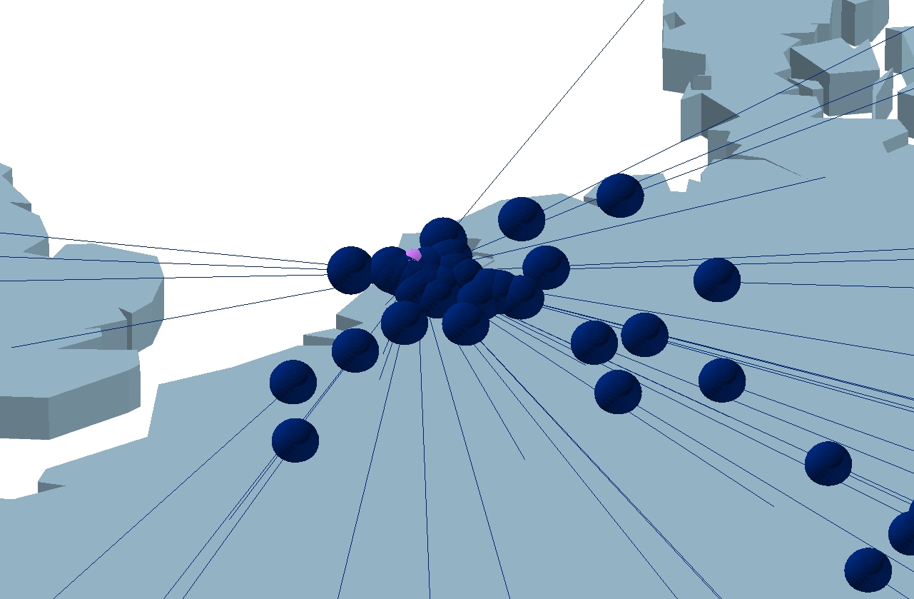
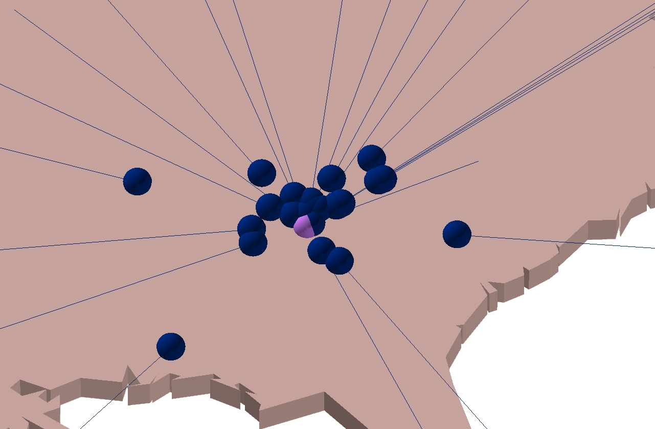
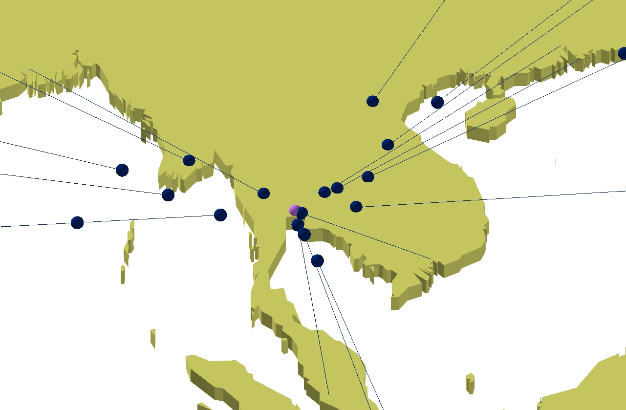
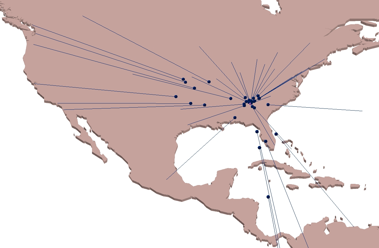
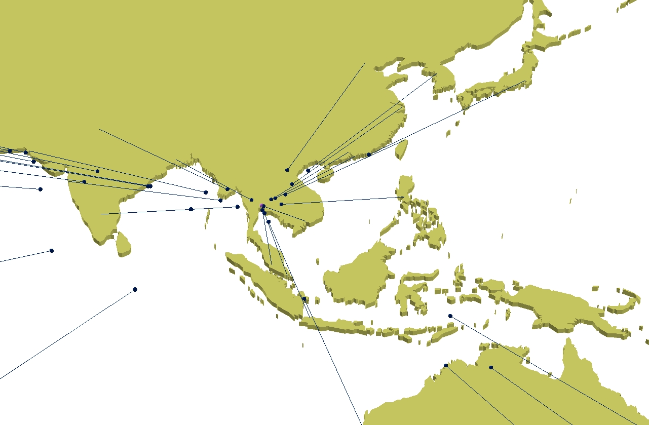
Atlas 2 City Views: Regional Compacting Atlas #2 represents a fundamental shift in the research group's thinking about how to enhance the World City Network visualizations. After developing the first two Atlases, the research group realized that using flow lines to represent strength was limiting. Considering that a primary goal of the visualizations is to address a recurring theme in World City Networks - connectivity is changing the way we view the world - we focused on displaying this new effect. A key issue with Atlas #1 and #1A is that they emphasize absolute geography over connectivity. In order to show how connectivity is changing the way we view the world, the research group realized we need to be emphasizing connectivity first and geography second. For Atlas #2, the research group decided to depart from the concept of using flow lines t o represent the strength of a city's connection to its peers. Instead, we addressed the clutter problem in Atlases #1 and #1A by developing more schematic visualizations. Using a concept called multi-dimensional scaling [1] , the research group developed visualizations which show how Peter Taylor's world city network connections alter "absolute" geography.
for all 154 views click here or scroll down 1. We selected the top 123 cities in terms of their global network connectivity and measured the connectivity between each city and the other 122 cities. All 123 cities and their connectivity values are weighed against each other. Connectivity and absolute distance are made relative to each other, and city position is shifted based on connectivity strength. Seventy-seven cities, representing all world cities within North America, Europe, and Pacific Asia are used in this Atlas. 2. New weighted locations for the cities are created, and lines are also created to show the path the cities traveled toward or away from the central city. Points represent cities in their new location, and the lines show the path the cities took from their absolute location. The path is a trajectory from the central point to the absolute location. 3. ESRI's software, ArcGIS v.8, is used to create the weighted cities locations and visualizations from the raw connectivity and absolute distance values for each city. 4. In order for the maps to be viewed by users, they were exported into .jpeg picture files. 6. For those users who desire to manipulate the visualizations in a GIS, the Base Layer Shapefiles are included - ! 212MB (click here). This includes the country outlines and each individual city's point shapefile with connection and distance values included. If the user is interested in how the layers were constructed, then they can e-mail Jared Lang at jlangcal@hotmail.com. Understanding the Visualizations: 1. The points shown in the visualizations are the new city locations once they are adjusted based on their relative connectivity score. The points travel a specific distance along the trajectory of the line drawn between the original point and the central point. The start of the line is the original location (absolute geography) of the city. 2. Blue dots and lines move closer to the central city. Red dots and lines move away to the central city. 3. We picked optimal views for each region to give the best view of the cities' hinterworlds. Links to Regional (R) and Zoomed (Z) Views: EUROPE: NORTH AMERICA: PACIFIC ASIA: more cities to follow If you have any questions about the Atlases, or if you want to obtain the details about how the visualizations were created, you can e-mail Jared Lang, Danny Dorling, or Peter Taylor Endnotes [1] Kruskal, J.B. and Wish, M. (1978). Multidimensional Scaling. Beverly Hills, CA: Sage.
Back to: [Atlases by Jared Lang ] |
|||||||||||||


