
Atlases by Jared Lang - Atlas 1a |
|
|
|
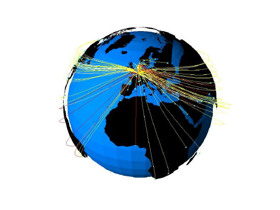
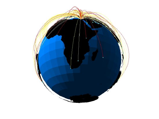
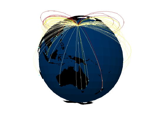
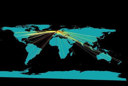
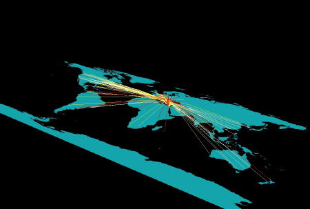
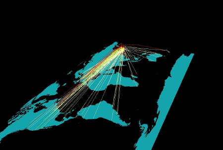
Atlas 1a Experimental Atlas - Representing Flow Lines in Three-Dimensions Part 1 - Wrapping 3D Flow Lines Around a 3D Globe For the second set of visualizations, the research group sought to experiment further with flow lines to represent the strength of a city's connection to its peers. To address the clutter problem in Atlas #1, we decided to develop three-dimensional flow lines, as well as three-dimensional surfaces. As with Atlas #1, the most current work done mapping three-dimensional flow lines comes from mapping global internet [1] and phone connections. [2] In the visualizations below we adapt concepts from mapping global internet and phone connections to represent Peter Taylor's world city network connections in two new visualizations. The images are interesting, but the research group did not fully develop the Atlas because, upon completion, we realized the new visualizations did not solve the problems we encountered in the first Atlas.
for all 24 snapshots and 3D scenes click here
The Method of Creation: 1. We selected the top 123 cities in terms of their global network connectivity and measured the connectivity between each city and the other 122 cities. Twelve samples cities are visualized below for the two different types of visualizations using 3D flow lines. 2. These individual city inter-linkages reflect the overall pattern of global network connectivity (i.e. every city is most connected to either London or New York). 3. ESRI's software, ArcGIS v.8, is used to create three-dimensional visualizations of the raw connectivity values for each city. 4. In order for the maps to be viewed by users, they were exported into Virtual Reality Modeling Language (VRML). Hence, the format of the links posted below. Each city has an individual link. 5. VRML scenes require a VRML Player. If users follow the directions and download the free Cosmo Player software, they can view the maps through the web browser on their own computer. The link to the Cosmo Player software is as follows: Cosmo Player Software: http://ovrt.nist.gov/cosmo/ 6. For those users who desire to manipulate the visualizations in a GIS, the Base Layer Shapefiles are included (click here). This includes the background globe, country outlines, and each individual city's point shapefile with connection values included. If the user is interested in more detail, then they can e-mail Jared Lang at jlangcal@hotmail.com. To View the Visualizations: 1. If the user's computer utilizes Microsoft's Windows XP operating system, then the Windows NT version of the Cosmo Player software is the one they need to download. 2. The links below are zip files containing the entire VRML scene and the legend for each city. Images are provided below to give users a snapshot of what the scene looks like. Depending on which cities the user is interested in, they just need to download those zip files to their computer. 3. Once unzipped, all scene files need to stay in the same folder. The scene file at the top will open the entire visualization. The user must make sure their web browser is open before they click to open the scene. 4. When inside the scene, click on the globe with the "Seek" tool to center the globe or flat map in the scene. This enables the user to use the "rotate" tool to rotate the globe from its center. For reference, an image of the "seek" tool is below. Understanding the Visualizations: 1. Flow lines connect each city. For example, the London scene shows flow lines from London to the other top 123 cities. Color of the flow lines represents the strength of connectivity. 2. This is a basic legend. The strongest connections are made to stand out with the red lines. The choice of colors for the globe and country outlines was designed to draw out the flow lines. An Important Endnote: The research group ran into the same problems with these visualizations as we did in Atlas #1. Again, we attempted to represent such a large dataset, and some visualizations became cluttered. Consequently, it may be difficult to fully understand the relationships between some of the cities. Atlas #2 fully addresses these problems. If you have any questions about the Atlases, or if you want to obtain the details about how the visualizations were created, you can e-mail Jared Lang, Danny Dorling, or Peter Taylor. Endnotes [1] Dodge, Martin and Kitchin, Rob. Mapping Cyberspace. London: Routledge, 2001. [2] Thomas, Bethan. The Visualization of Flow Data: From UK Telephone Calls to a General Method. Leeds, UK: The University of Leeds School of Geography, September 2002. Back to: [Atlases by Jared Lang ] |
|||||||||||||
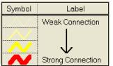 Basic Legend