GaWC Research Bulletin 31 |
|
|
|
This Research Bulletin has been published in G Dijkink and H Knippenberg (eds) (2001) The Territorial Factor: Political Geography in a Globalising World Amsterdam: Vossiuspers UvA, 113-28.
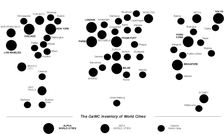
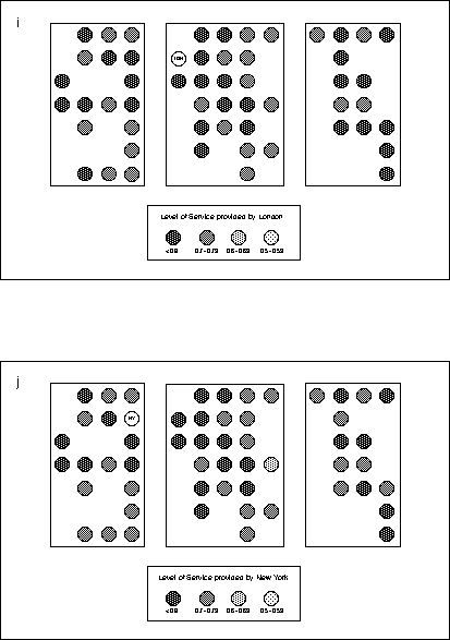
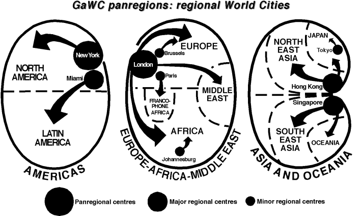
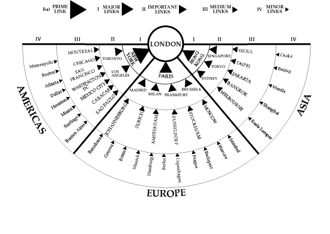
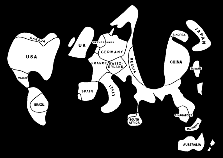
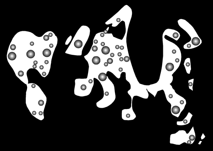
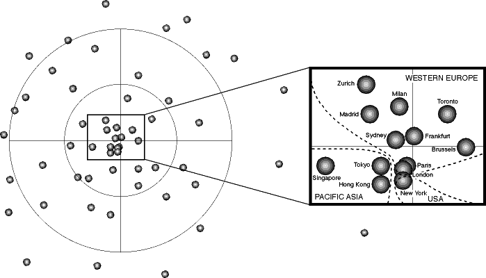
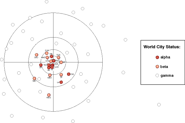
THE PROJECT: GaWCThe Globalization and World Cities (GaWC) Study Group and Network is organised from Loughborough University through a dedicated web site.1 Its raison d'être is to promote the collection and analysis of inter-city data at a global scale. As such it challenges the way in which most international (sic) studies are conduction in two ways. First, the basic entities under scrutiny are cities rather than states. Second, the focus is upon relations - links, connections, flows - rather than attributes - the 'taking stock' emphasis of censuses and most other official data collection agencies. Hence, GaWC aspires to provides an alternative perspective on the world to that of orthodox state-centric social science (Taylor, Walker and Beaverstock, 2000). This is, of course, a very tall order. Data production by states across the world is continually creating mammoth amounts of new 'stat-istics' for use by social scientists in reproducing their state-centric disciplines (Taylor, 1997). In this way international (sic) and development studies (usually using UN statistics provided by states) become attributional comparison of countries. Such common practice, however, is not necessarily the main challenge facing the GaWC project. There is a deeper issue of geographical imagination in the modern world. The world political map is instantly recognised by all the world's schooled population, no doubt a function of its ubiquitous location on classroom walls. The lines on this map - state boundaries - have been described as appearing to be as 'natural' as the physical features of the world, the (largely) natural coastlines, rivers and mountains (Jackson, 1990). Seeing world-space through such state-tinted glasses creates a mosaic picture of the modern world, a space of places rather than a space of flows, to use Castells' (1996) popular terminology. Given the circumstances of contemporary globalization with rising trans-state processes, the dominance of this mosaic map with its resultant mosaic social sciences is hardly appropriate for social research in the new millennium. Hence the GaWC project. This world political map domination can be termed a metageography. Lewis and Wigen (1997, ix) define metageography as the set of spatial structures through which people order their knowledge of the world: the often unconscious frameworks that organize studies of history, sociology, anthropology, economics, political science, or even natural history. With respect to the 'states-metageography', I would add international relations and development studies to this list. The world city network, therefore, can be interpreted as a putative alternative metageography, a 'cities-metageography' for the twenty-first century (Beaverstock, Smith and Taylor, 2000). But today, cities only exist within the states-metageography; in general perception London, New York and Tokyo remain foremost British, American and Japanese rather than 'global' despite a growing literature emphasising the latter. How do we begin to erode this one-sided view of the modern world? Translating GaWC's challenge into a question of metageography leads us into the realm of visualization. Metageographies are pictures, visual images we carry around in our heads. Thus to work, they have to be relatively simple and simply memorable. Visualization is about creating easily interpretable pictures from complex data (McCormick, DeFanti and Brown, 1987; Orford, Dorling and Harris, 1998). In the case of world cities this means converting their myriad relations into intelligible images of a new world-space. Displaying world cities on uncomplicated maps represents only a first stage in visualization for a new metageography however. Visualization is about much more than image creation, data is not just passively displayed, it is depicted in such a way as to generate new knowledge. In visualization the image is not the final output, the viewer interacts with it to find new patterns and relations in the data. It is this feature which makes visualization so important for the GaWC project. In attempting to embark on the road to a cities-metageography we require geographical images which go beyond display to invite people to think in new ways about their world. The basic position of this paper is that experiments in visualising a modern world of cities are necessary to combat the dominance of a mosaic perception of world-space. First rudimentary efforts to capture a new world space are displayed and discussed in this paper THE PROBLEM: COMPLEXITYThe initial data set we have created to study world city relations consists of 55 cities (Beaverstock, Smith and Taylor, 1999). These cities have been identified on the basis of their provision of advanced producer services: they are ordered by three levels of importance as 10 alpha cities (e.g. London), 10 beta cities (e.g. Toronto) and 35 gamma cities (e.g. Jakarta). Relations between cities are defined in terms of the office networks of 46 corporate service firms (Taylor and Walker, 2001). These 'global firms' have been selected on the basis of their having offices in 15 or more different cities. For each firm, its provision of service in each city is measured from 0 to 3 based upon the size and importance of offices. The result is a 55 x 46 matrix within which each pair of cities can be compared in terms of the similarity of their corporate service mix. This is used as an estimate of the relations between the cities: the assumption is that the more any two cities house offices from the same firms (i.e. the have similar office mixes), the more strongly interlocked they are within the world city network. This process produces a 55 x 55 inter-city relational matrix (Taylor, 2001). In terms of data display the contrast with the states mosaic is stark. Whereas world-space presentations of data for states typically consists of simply mapping selected attributes on to c.200 areas, for the world city network as defined here there are 2,970 relations (55x55-55) available for exhibit. This is a quantum leap in geographical complexity. Fortunately, since the origins of visualization techniques lie in the handling spatial complexity, they have a specific pertinence for imaging a cities-metageography. The remainder of this paper charts the way in which I have attempted within GaWC researches to show world cities and their network within world-space: 'worlds according to GaWC' is how they are referred. The initial experiments in new images has handled the complexity through focusing first upon the 55 nodes in the network. This has involved two basic approaches. The first involves reconfiguring world space to make the display of cities, their patterns and relations clear to see. The second involves creating a completely new world-city space to show the pattern of cities in terms of their corporate service relations. Both approaches result in static outputs, I conclude by outlining future plans to explore more dynamic visualization possibilities. RECONFIGURING OLD WORLD SPACESFrom the very beginning of the GaWC project it was clear that there was a mapping problem in the presentation of results. This is because world cities are concentrated in three regions (northern America, western Europe and Pacific Asia) so that displays on conventional maps show a mixture of 'clutter and emptiness'. This is not necessarily an uninformative message to send - for instance, the paucity of world city formation in Africa is starkly shown - but it does prevent clear viewing of the detail in the clutter. This is, of course, a common cartographic problem and I have dealt with it in two ways, though schematic geographies and by cartogram. Schematic geographies: bullets, boxes, regions and arrowsSchematic diagrams portray the essence of a situation by depicting only designated basic relations in an idealised manner. Schematic geographies depict spatial relations in this way: the resulting geographies can be severely distorted in order to elucidate a particular pattern. They remain 'geographies' rather than just ordinary diagrams because the underlying 'co-ordinate geography' remains discernible, providing an interpretative link between the 'ideal' and the 'real'. Four such schematic geographies are discussed here, ordered in terms of degree of distortion of world-space. The first schematic geography (Figure 1, from Beaverstock, Smith and Taylor, 1999; Taylor, 2000a) depicts the original 'world according to GaWC': a world with no boundaries. Cities are depicted in an undifferentiated space as three clusters of 'bullets'. Apart from the spatial relations, the only other information displayed is the status of the cities as alpha, beta or gamma. It shows very clearly the three northern hemisphere globalization arenas (northern America, western Europe, Pacific Asia) with their many world cities and with each having a relatively weak 'southern' tail. The lacuna of world cities in non-Pacific Asia enables this large land area to be considered in the same way as the Pacific and Atlantic Oceans: in this world where there are no lines, all three are treated as spatially alike, merely the gaps between the clusters. Obviously this schematic geography is designed to be the very opposite of the world political map mosaic; it is the starting point for any exploration of cities-metageography. The second schematic geography (Figure 2, from Taylor, 2001b) is based very much on the first but is created as a 'neater' version. Here simple boundaries are added to box in the three clusters and thus accentuate their separateness. In addition the statuses of the cities are omitted thus further simplifying the presentation. We have found this schematic geography to be ideal for presenting comparative information on the world cities. With the key, it is easy to find your way around the cities and by keeping the basic 'cluster geography', patterns of contrast across globalizing arenas and their environs can be seen. The case illustrated is difference between London and New York's relations with other cities in terms of number and size of their respective service office links (from Taylor, 2001b). The finding illustrated is that London has more links with other world cities overall but that New York tends to have better service links with other leading world cities. In the third schematic geography (Figure 3, from Taylor, 2000) , simplification is taken much further by focusing on only those cities which have important regional headquarter functions. The three regional patterns remain but on this occasion organisation and control functions are depicted to show how 'pan-regions' relate to just five major regional centres (Taylor, 2000, Table 8). As well as showing the rivalry between Hong Kong and Singapore, the wide regional scope of London and New York's dominance in its cluster, the peculiar eccentric role of Miami in Latin America is clearly portrayed. Simplifying further, the fourth schematic geography (Figure 4, from Beaverstock, Smith and Taylor, 2000) portrays a unicentric pattern. Focusing just on London, the strength of relations with London in terms of number and sizes of office links are shown as four levels of arrow pointing at London. Maintaining the three-fold geographical clustering of cities, this diagram shows very clearly London's global reach with relatively similar levels of linkage across all three regions. As well as being a leading regional world city (Figure 3), this geography confirms London is also the archetypal global city. As these schematic geographies have been simplified, so they have moved further from the underlying 'co-ordinate geography'. While portraying particular themes within world city relations quite effectively, for more general purposes it is necessary to return to the overall pattern and consider alternatives to simple bullets. The world city formation cartogramThe standard cartographic approach for displaying a very concentrated or uneven spatial distribution is to construct a cartogram (Tobler, 1963; Dorling, 1994, 1996). In a cartogram areal extent is made proportional to the frequency of the phenomenon under consideration. Thus instead of depicted areas representing actual geographical areas as on a conventional map, on a cartogram depicted areas are drawn to a size which represents another variable. The most famous cartograms are demographic, areas are made proportional to population thus showing, for instance, the relative demographic importance of China. There are several rules which can be applied when creating a cartogram but the chief advantage of this mode of presentation is obtained when shape and relative positions are preserved as much as possible. In this way familiar features of a space are still recognisable thus greatly aiding interpretation of the cartogram. I have extended the world city data for construction of a cartogram. In the original analysis which identified the 55 world cities there were another 77 cities which showed evidence of world city formation (Beaverstock, Smith and Taylor, 1999). That is to say, there was some corporate service provision but not at a level sufficient to warrant designation as world city. The advantages of using this additional information is that more areas of the world are covered enabling shapes and relative positions to be better preserved. For instance, India will no longer be missing from the geography, its familiar shape can be portrayed but, of course, at an unusually small scale. The whole purpose of the cartogram is to show the distribution of world city formation in a world-space which is still reasonably recognisable. The world city formation cartogram was constructed by adding up total values for world city formation by country and reconstituting the states mosaic to keep approximate shapes and relative positions. The result is shown in Figure 5 where the main countries are named. The final cartogram dispenses with the state boundaries and locates the world cities in this city-distorted space (Figure 6, from Taylor, 2001c). Notice that by adding the extra cities the three cluster pattern is modified by the depiction of the southern Asian littoral. There is still, of course, a large hole in central and northern Asia separating Russia from China where world city formation is not happening. The cartogram also shows the dominance of South Africa in Africa in terms of world city formation and the overall dearth of the process in that continent. Finally this depiction of world cities confirms the relative importance of western Europe vis a vis the other two globalization arenas. * * * * * * * * I have called this section 'reconfigurating old spaces' precisely because in both the schematic geographies and the cartogram the 'co-ordinate geography' is still recognisably there underpinning the 'distortions'. As I have previously suggested this has important cognitive implications. But this positive feature is countered by a negative side to these approaches as depictions of world cities and their network. Despite concern to treat relations between cities, these depictions are based upon attributes. No doubt the outcomes of inter-city relations, nevertheless the geographies produced are based upon aggregating service levels without using any direct measures of relations between cities. Since the latter are a central concern of the research it is necessary to try a different take to complement the simple geographical 'distortions' presented above. CREATING A NEW WORLD-SPACEIn this section a completely new space is created. There is no attempt to constrain the solution to 'real co-ordinate geography', rather different co-ordinates are produced for a different sort of space. The new space can be called corporate service space. It is created from corporate service distances between cities (Taylor, 2001a). These are computed from similarities between cities on the basis of the match between corporate service mixes in any two cities. If two cities have exactly the same firms with exactly the same level of service they would score one. In reality all pairs of cities score something below unity. Taking these scores from unity creates 'distances' with very similar pairs of cities having short 'corporate service distances' recorded between them: the distance between the ideal perfect match pair is, of course, zero. In this way the 55 x 55 similarity matrix becomes a 55 x 55 matrix of global service service distances between cities. Multidimensional scaling is a technique for converting distance matrices into spaces.2 Spaces are produced at different dimensions in such a way that the distances in the matrix are reproduced in the created space as near as is possible. The higher the number of dimensions the better the fit between input-distances and output-space but, of course, this comes at the price of losing visualization for higher dimensional spaces. Experiments with a three-dimensional solution have proven difficult to depict and therefore only two-dimensional outputs are discussed here. The latter have the key advantage of ease of presentation and reading in the manner of conventional maps and can be compared with the distorted geographies above. A two-dimensional scaling of the global service distance matrix produces a global service space within which the world cities are distributed (Figure 7, from Taylor, et al., 2000). This produces a very different image of the pattern of world cities than heretofore. This space has a highly centric structure, a dense concentration of cities in the middle with lower city densities towards the outer periphery. When the statuses of cities are depicted in this new space it is the alpha cities concentrated at the centre with gamma cities in the periphery (Figure 8, from Taylor, et al., 2000). This shows the very close similarities in service provision among the major world cities. But this does not mean that the regionality displayed earlier is lost? Identifying cities by region shows very clear zones for the three globalization arenas (Figure 9, from Taylor, et al., 2000). Out of the 55 cities, there are in fact only four serious ' geographical outliers' (Istanbul, Kuala Lumpur, Moscow and Osaka) in this analysis, a remarkable result for just a two-dimensional solution. (The implication is that extra dimensions are required to accommodate the service provision nature of these cities.) The Europe zone is the most complicated including Canada and Australia on its USA side. The former eastern European cities (Budapest, Prague Warsaw) are at the other edge of the Europe zone. At this dimensional level, Latin America is split; three cities (Buenos Aires, Caracas, Sao Paulo) are in the Europe zone located between Madrid and Barcelona but the other two cities are in NAFTA states (Mexico City and Santiago). This new world-space provides a remarkable picture of world cities and their inter-relations. It defines a clear centric pattern which reflects the statuses of cities but it also captures the regionality of world city relations. This is a completely new visualization of the modern world, a corporate world beyond states ... except for the USA! FUTURE EXPERIMENTS: FLOWS AND MEDIAI began this chapter by arguing that cities represent a 'space of flows' at least as relevant to understanding the modern world as the 'space of places' promulgated by the traditional mosaic world political map. Focusing on nodes in a world city network and latterly deriving distances from inter-city relations does take us along a route to a space of flows but, in truth, I have not travelled very far down this path. In fact, flows are notoriously difficult to portray in simple cartographic form. There is a limit to the number of flow-arrows which can be portrayed before overlapping creates a confused image. This can work as a visualization devise when the purpose is to express the magnitude and complexity of flows as in the depictions of internet use. But the detail is lost in the mass of information portrayed. Evidence from the recent 'Review of Visualization in the Social Sciences' Report (Orford, Dorling and Harris, 1998) suggests that in the social sciences at least there have been few attempts to create visual models of complex flow patterns. There are examples of economists attempting to portray trade patterns (p. 26), and sociologists doing the same for social networks (p. 27), but the conclusion of the Report is that we are only at the beginning of this work. The visualizations above, and the examples Orford, Dorling and Harris (1998) describe, are all essentially static in nature. Since flows are intrinsically mobile in nature it is, at least, plausible that quite different media to either 'distorted' or 'new' maps will ultimately become the way in which spaces of flows, including that world-space of flows organised through world cities, will be visualised. Orford, Dorling and Harris (1998) point towards animation and virtual reality with the world-wide web as the 'ideal medium' (p. 12) as the way forward. This is the direction GaWC will go in its experiments in visualization. Animations provides for the possibility of showing flows between cities as movement. Clicking on a city and seeing its inter-city connections moving across the screen is the starting point here.3 Virtual reality techniques hold the prospect of constructing corporate service space and allowing an interactive traveller to be a 'message', moving around the space to explore its structure while 'contributing' to new city knowledges. The pedagogic implications of this are quite exciting. The way metageographies are formed and maintained will undoubtedly be different in the future. This is good news for those who wish to challenge the dominance of the simple mosaic state-metageography. It is good news for the GaWC project. REFERENCESBeaverstock, J V, Smith, R G and Taylor, P J (1999) 'A roster of world cities', Cities, 16, 445-58 Beaverstock, J V, Smith, R G and Taylor, P J (2000) 'World city network: a new meta-geography?' Annals, Association of American Geographers, 90, 123-34 Castells, M (1996) The Rise of the Network Society. Oxford: Blackwell Dorling, D (1994) Area Cartograms: their Use and Creation. CATMOG 39, Norwich: Environmental Publications Dorling, D (1996) 'Cartograms for visualising human geography', in H M Hearnshaw and D J Unwin (eds) Visualisation in Geographical Information Systems. Chichester: Wiley Jackson, R H (1990) Quasi-states: Sovereignty, International Relations and the Third World. New York: Cambridge University Press Lewis, M W and Wigen, K E (1997) The Myth of Continents. Berkeley: University of California Press McCormick, B H, DeFanti, T A and Browm, M D (1987) "Visualization in scientific computing', Computer Graphics, 21 (6) Orford, S, Dorling, D and Harris, R (1998) Review of Visualization in the Social Sciences: a State of the Art Survey and Report. Bristol: School of Geographical Sciences, University of Bristol Taylor, P J (1997) 'The crisis of boundaries: towards a new heterodoxy in the social sciences', Journal of Area Studies,11, 11-31 Taylor, P J (2000) 'World cities and territorial states under conditions of contemporary globalization', Political Geography, 19, 5-32 Taylor, P J (2001a) 'Specification of the world city network', Geographical Analysis, (in press) Taylor, P J (2001b) 'Urban hinterworlds: intensities of service provision under conditions of contemporary globalization', Geography (in press) Taylor. P J (2001c) 'World cities and territorial states II: looking forward, looking ahead', in A Gosar (ed.) Political Geography in the 21st Century (in press) Taylor, P J, Hoyler, M, Walker, D R F and Szegner, M J (2001) 'A new world map for the new millennium', GaWC Research Bulletin 30 Taylor, P J and Walker, D R F (2001) 'World cities: a first multivariate analysis of their service complexes', Urban Studies, (in press) Taylor, P J, Walker, D R F and Beaverstock, J V (2000) 'Introducing GaWC: researching world city network formation' in S Sassen (ed.) Telematics and Global Cities. Oxford: Blackwell Tobler, W R (1963) 'Geographic area and map projections', Geographical Review, 53, 59-78
NOTES1.This can be visited at: http://www.lboro.ac.uk/gawc/ 2. I acknowledge the work of Michael Hoyler (Heidelberg) for carrying out the multidimensional scaling from which the new world space was created. 3. Early experiments have been carried out by Phil Gersmehl of the University of Minnesota. Figure 1: Bullets: the world according to GaWC
Figure 2: Boxes: comparing London's and New York's service provision across world cities
Figure 3: Panregions: major regional world cities
Figure 4: Arrows: world city linkages to London
Figure 5: Cartogram I: world-city formation space showing major states
Figure 6: Cartogram II: world-city space showing cities
Figure 7: Global service space I: the centric structure
Figure 8: Global service space II: alpha, beta and gamma cities
Figure 9: Global service space III: regionality
Edited and posted on the web on 20th September 2000 Note: This Research Bulletin has been published in G Dijkink and H Knippenberg (eds) (2001) The Territorial Factor: Political Geography in a Globalising World Amsterdam: Vossiuspers UvA, 113-28 |
||